Triple Crown Series App
UX/UI, Branding, Real-life Proposal
Design roles | UX Design | Brand & Identity | Visual Design | Research
Duration | 2 Months - August - September 2023
Tools and Software | Figma | Adobe Photoshop | Adobe Illustrator
Design Deliverables | MVP | Personas | Competitive Analysis | Concept & Identity | Digital Prototype | Wireframes | User Testing | Visual Design
An app where Canadian Motocross fans can watch live timing wherever they are in the world
This is a long case study. You might want to get your favourite beverage of choice and get comfortable
Introduction
As a viewer of my website and portfolio, you will most likely sense my love for motocross. I emigrated to Canada from South Africa in 2022, and it wasn’t long until the urge to research the local motocross scene began. Coming from South Africa, where the sport is small and information is hard to find, I assumed being in a first-world country would be completely different. (At the time of writing, finding results sheets and getting information from the South African Motocross racing scene has become highly frustrating). Social media is a weave of unhelpful information, and one must pay a subscription fee to view results. The archives have been put away, and the only way to get these is to mail the timekeepers who don’t respond to emails. The only way to track results is through live timing, which is visible on the specific website.
It is significantly better in Canada; however, it is not perfect. Currently, the organisers do a great job with their website. There is a plethora of information for fans, racers, teams and sponsors. This comes in news articles, links to watch the racing live (that require subscriptions), event information, sponsors/partners information, past results, and rider services information. It is a one-stop shop for everything related to Canadian Professional Motocross.
My two pieces of constructive criticism would be the Visual Aspect of the website and the Timing/Results section.
Regarding the visual aesthetic, the website could do with some tweaks and possibly a touch-up. The images used are great and do an excellent job showcasing the racing and bringing great colour. The font (Poppins) is a popular, clean sans serif typeface that gives it a professional, clean look. Consistency regarding the rounded-off corners could be applied to some elements, as they are used in the buttons. The championship tables and the way they present data could be cleaned up. The parts I struggled with were how the results and live timing were done. While it does the job, I believe it could be better. This is done through a third-party company, so displaying the data differently could be challenging.
Problem
I went to the fifth round of the series held at Sand Del Lee MX track just outside of Ottawa, Ontario, in July 2023. I met up with a Canadian friend I hadn’t seen in a decade, and we took the day with our wives to watch some good racing. It worked out perfectly.
While at the racing, it is great to have an app or website open and view the live timing as the actual race is going on. I am sure some would ask, “Well. Why would you look at the live timing when watching the race with your own eyes?” As a previous racer and fan of the sport, getting that extra layer of data is helpful. You can see if a racer is closing the leader, who has the fastest time of the race so far, how many minutes to go, etc.
While at the races, and just being flooded with cognitive overload, excitement, new sights, and sounds, being at the track again (first time in over a year), seeing friends I haven’t in a while, I never got the chance to sit quietly for 10 minutes to determine how to view the live timing on my phone. There wasn’t an App, and my friend mentioned that you could view it on the website. A few days later, I went to the website, and it was complicated. It is tricky to find and challenging to view the timing on your phone. The page isn’t optimised for mobile, which makes for super small text and difficult scrolling (horizontal and vertical).
The Solution
After considering various solutions, the idea of an app stood out to me. While optimising the site for mobile was an option, I was inspired by a successful US app for the US AMA Professional Motocross series. I then decided on an app focused on the Canadian Triple Crown series. This app would serve as a central hub for racers, fans, families, organisers, teams, and sponsors, focusing primarily on live timing. It would cater to race attendees and those remotely seeking real-time race data and results.
Process
I am a strong advocate of the Double Diamond design methodology in my UX process. By adhering to its phases, I gain a profound understanding of the user and the issue at hand, allowing me to pinpoint the most effective solution.
Having been a UX designer for several years and working with multiple companies, I recognise that the Double Diamond process can be time-consuming if done thoroughly. Tasks that might seem simple, like user journeys, can actually involve extensive research, interviews, data synthesis, and solution refinement. For this project, I wanted to focus on creating a Minimum Viable Product, being mindful of time and effort limitations. Adding numerous features is tempting, but I wanted to strive for a balanced approach.
With this in mind, I focused on the following:
-
Having enough of a concept to present to the owners of the Triple Crown Series (if possible);
-
Focus intensely on the main problem at hand;
-
Determine the minimum features essential on the App's first launch.
-
Keep the visual aesthetic in line with what’s currently available on the website to maintain multi-platform consistency; and
-
Ensure the App is visually appealing, easy to use and accessible.
I was determined not to settle for my initial solution on any screen. I wanted to push my creativity and design thinking to produce solutions that truly benefitted the app's users. Relying on first impressions might have led to a lacklustre User Interface. Often, I wrestled for hours until I reached a design I was satisfied with. However, like most projects, this work is never truly complete. Iterations, testing, and continuous improvements are essential. Furthermore, a lack of insight into how the timing pages currently retrieve data could significantly influence the app's design.
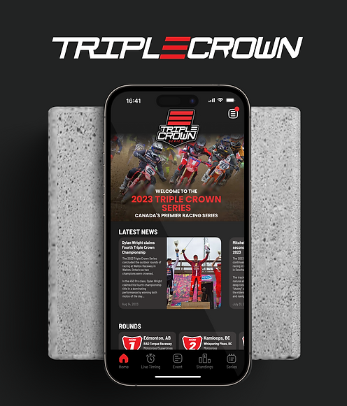
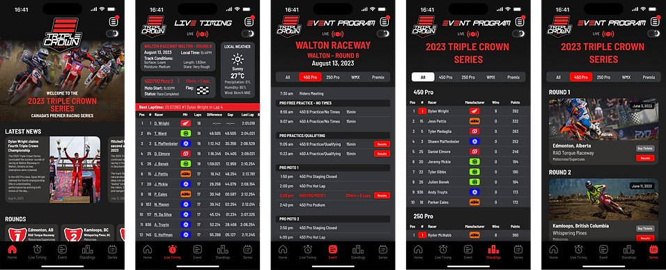
The solution I ended up with consists of just five screens. While I'll discuss future states and features at the end of the case study, these screens are pivotal for the MVP upon initial launch. They align with the bottom navigation, making them suitable for the presentation. I dedicated considerable effort to iterating each screen, which posed unique challenges in presenting data and information.
Research and Synthesis
Once I had decided on an app, I got to work on researching companies that currently do this, and surprisingly, there aren’t too many. I’ve listed them below with my findings/thoughts.
Mylaps Speedhive App
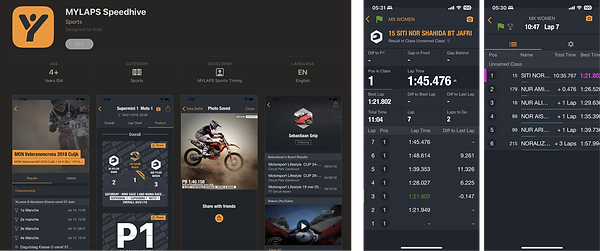
Mylaps Speedhive is the official app of Mylaps.com, a renowned timing equipment company from the Netherlands. It's an essential tool for racers, allowing them to sort their race data, laps, and individual performance metrics. Users can also buy their transponder and create a profile on the Mylaps website for enhanced features. The app's vast capabilities include searching for global past events, diving deep into race and racer data, and accessing live timing. Recognised as perhaps the world's premier motorsport timing service, Mylaps has accumulated vast amounts of data over the years—its most significant strength in my opinion. Although its dark mode interface is visually appealing, the displayed data can sometimes feel overpowering. However, the challenge for all timing apps is to display the data effectively on small mobile device screens without confusing or overwhelming the user.
Race Monitor App
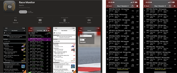
Race Monitor is another great app, boasting abundant data and diverse features across various events. Despite being a bit overwhelming with the data they provide for each competitor, the app does a great job displaying this data.
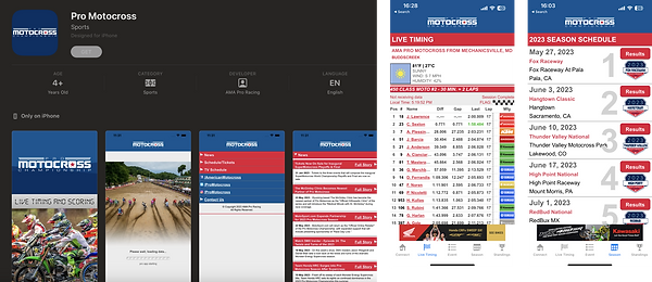
AMA Pro Motocross App
According to the App Store: "The Pro Motocross app provides fans with live timing & scoring for every on-track session at Pro Motocross Championship events. Users can delve into a rider's data by tapping their name, revealing all lap times for the active session. The Event Schedule tab dynamically updates during events, offering entry lists, official results, lap time reports, points standings, and box scores. On the Season Schedule page, enthusiasts can access archived results from 2013 onward. Current news and the upcoming TV schedule can be found on the Connect Page."
For US Motocross Fans, this might be the best timing app on the market. As the top Motocross series in North America, AMA Pro Motocross' live timing feature works well for fans. It delivers precisely what one would anticipate, with additional series specifics. However, the user interface feels somewhat dated and could benefit from a facelift.
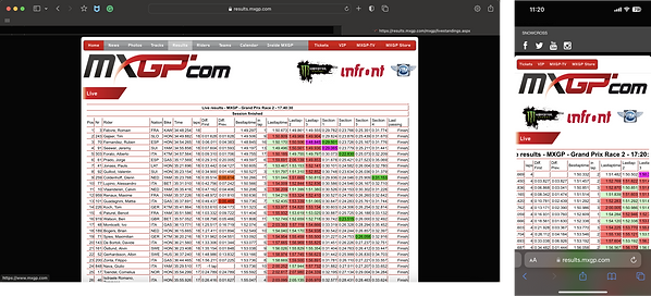
The MXGP.com Website
The MXGP.com website, the official online hub for the World Motocross Grand Prix series, provides live timing. Though accessible on mobile, it's not particularly mobile-friendly. The data it offers, such as sector times, fastest laps, and the live timing features, is thorough. Their archives include a wealth of past results. However, navigating the website on mobile devices can be cumbersome.
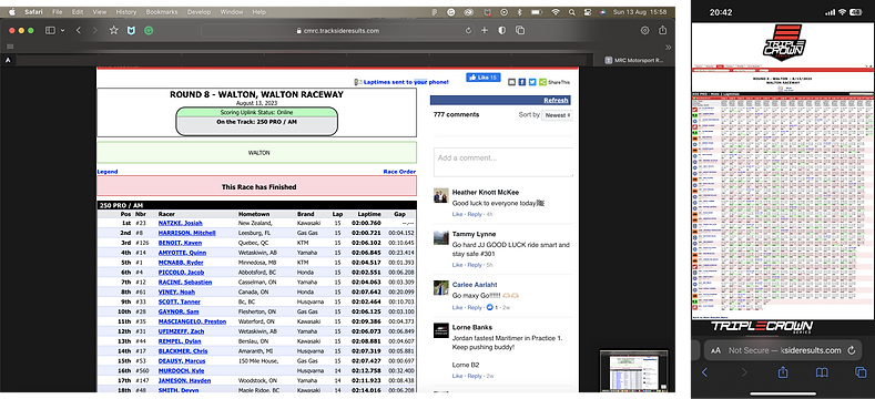
The Triple Crown Motocross Series Website
For followers of the Canadian Triple Crown Motocross series, the live timing section of the mobile website is the go-to platform. Yet, it is not optimised for mobile view, making some text appear small and the overall layout clumsy. There's a noticeable need for a dedicated mobile app where Canadian fans, racers, mechanics, and teams can access live results seamlessly. Such an app would serve as a centralised hub for all relative race information available on the go.
Having raced motocross for over 20 years and travelled the world, I also have experience using various platforms and the industry. The learning curve for getting familiar with the industry was small. However, I do acknowledge I have bias. I therefore spoke to a few people in my network and received feedback on their points, frustrations, what works well and what doesn’t.
For any project, I always prefer deeper research. Ideally, this would have included more interviews, a survey, and even outreach to the Triple Crown Organisers. Such comprehensive analysis might have steered my decision-making differently. However, I chose to prioritise and focus on the MVP. I would also have liked to conduct usability testing, which would be the next step after presenting to the Triple Crown Organisers.
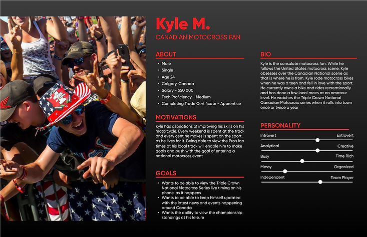
Drawing from my industry experience, I crafted personas. This case study highlights one such persona, the Motocross Fan. I also considered perspectives like the race mechanic and the Motocross Mom, keeping them top of mind in my design process. Additionally, I performed heuristic evaluations on the solutions I developed.
Parts of the synthesis stage I would include when diving deeper into the building of this App:
-
User Flows
-
Empathy Maps
-
Journey mapping and flows
-
Card sorting for App architecture
Again, going further into this research and synthesis stage would require more profound and detailed research, accurate synthesis and a detailed report summarising the findings. From there, solutions would be tweaked, increasing the quality and accuracy of the solution.
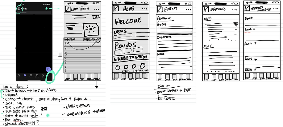
Develop and Delivery Stages
I started the visual design process by combing through the Triple Crown Website. I took screenshots, determined the fonts used and downloaded images. I struggled to find vectors of the logo and redrew it (On Figma). I noticed some inconsistencies there (being pedantic and pixel-perfect). Funny enough, after this, I downloaded the rules and regulations for the races where they provide all the logos.
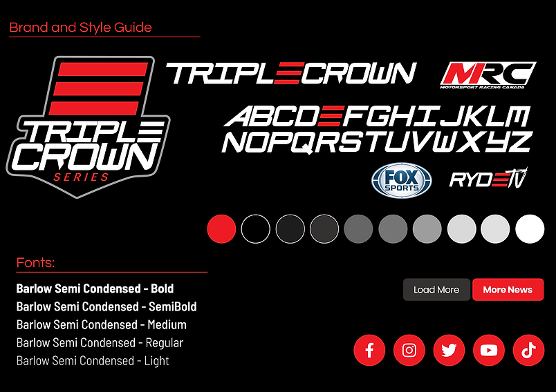
I created a mini design system in Figma, where I placed all the colours, fonts, and logos. I used an 8px grid and ensured spacing was consistent throughout. I created colour styles initially taken from the website; however, I slightly adjusted the greys to make them more visually appealing on the mobile screens. I also tried everything to see if the font used in the Triple Crown Logo was commercially available. I never found one and ended up creating the whole alphabet from scratch. I used the font for the larger headings for the top of the screens. This aligned well with my goal from the outset: a consistent feel across platforms.
One thing I did change was the Poppins font. While this works great on a desktop, the font takes up a lot of space, and the app is very text heavy. To be able to display a lot of text on the screen, I went for a more condensed, modern font. I used Barlow Semi-Condensed, which did the job perfectly. I used this font throughout the app in different sizes and weights.
I redrew the social media icons and aligned the buttons with what is currently available on the website. The red, rounded corners give a modern feel that aligns with the brand.
Overall Design Decisions and Considerations
From the beginning, I wanted this app to give off a professional and modern look. To achieve this, I went for rounded-off corners, a clean typeface, oversized cards, and a dark theme. Ultimately, my vision would be for the app to have Light and Dark modes to cater for the different environments in which the app could be used, indoors and outdoors. I did include a switch where the user can toggle between the two on the header of the app. This was done for quick, easy use, right where you need it. I played slightly with a light mode version on one screen; however, serious consideration and analysis must be done to ensure it is done correctly.
As mentioned before, the app is text-heavy. There are many racers (40 per class), and each racer will have their unique number, position, manufacturer, and their own lap times, points, etc. Displaying this on a mobile screen is difficult. I noticed when looking at most competitors that many their screens were too busy and overwhelming. I aimed to present this information in digestible chunks, preventing as much cognitive overload as possible.
The bottom navigation took a few turns to get right. The copy, as well as the icons, was something I spent a lot of time on. Again, modern, easy-to-understand icons were the goal here. Although many apps have gone away with labels (Threads, I decided to keep them on as it took the guesswork away for the user.
Finally, the menu icon with notifications. This would be a future state feature. My idea is that should a user want to, they can create a profile to follow their favourite riders. Under this menu would be settings, too, and possibly other links for more information regarding to the overall series.
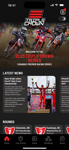
Screen 1 – The Home Screen
From the outset, one can see that the app home page is consistent with the websites. The large hero banner and welcome message will give the user familiarity. Here, they can view the latest news articles and the next rounds. The user can also select the respective links to watch the racing on live television or the streaming platform of their choice with a subscription. Finally, the user can select the relevant social media icon to take them to their chosen Triple Crown Series social media page.
This page is succinct, and this was done with intention. I wanted the home page to be an easy-to-navigate source of info for the user that is updated regularly after each round of the series.
Screen 2 – The Live Timing Screen
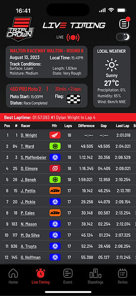
This took a few tries to get right and would undoubtedly be improved with more research and further iterations. One can lose context when looking at a 2-dimension screen of lap times. Users can feel frustrated when there is information lacking. I wanted to give users more context by providing information that helps the user paint a clearer picture. I placed three cards on the screen's top section to solve this. I added important information about the event in one card. This showed local time, track conditions, and the event’s name and track name. This eliminates the guesswork of calculating times zone, how many minutes are left in the race, whether the race has been stopped due to an injured rider, etc.
The second card details the race running at the moment: the length of the race (called a moto) and the status: Red flag – race stopped, Green – All Clear, White Flag – Final Lap and chequered – Race completed).
The third card gives weather conditions to complete the overall picture. Basic local track weather conditions can help the user determine the reasoning for certain occurrences in a race – slower lap times, riders struggling, etc. I added a status indicator to show that the race is currently live. This could also have a glow around it flashing on and off.
Using the data that the Triple Crown Series currently offers in web results drove the reasoning to show the last lap, fastest lap, gap, and difference. Without the whole picture here regarding the data available, it is difficult to build an accurate solution immediately. I iterated many times with the padding between the columns, which was again difficult. The sizing will differ depending on the number (e.g. Number 111 takes less space than number 369). Thinking about this and trying different variations drove this final design. I opted for a side scroll functionality to enable users to access more data on their favourite riders.
The challenge of presenting all this data with sufficient whitespace to breathe on a small screen is enormous.
Screen 3 – The Event Program Screen
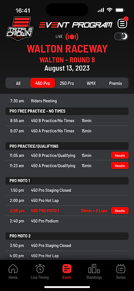
I used the actual data from the final round at Walton to populate this screen. Without organisation, this volume of information can be overwhelming. Thus, I segmented the events into easily navigable sections.
As race day progresses, more results become available. Buttons indicating these results will turn red for immediate visibility. Given the extensive events throughout the day, I introduced a segmented tab at the top to filter by class, making information more digestible. These tabs shift colours based on the selected class for clarity. Since the Pro classes are the day's highlights, they're consistently marked in red.
Screen 4 – The Series Standings Screen
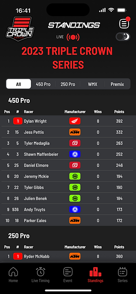
Here, the top 10 of each class will be displayed automatically. At a quick glance, a user can view the Triple Crown Series championship points of all the classes and select the segmented tabs to filter out their chosen class. Once selected, the complete set of results will drop down, showing all the points-scoring riders for that class.
Screen 5 – The Schedule Screen
For this final page, the segmented theme was used again. Here, you can select the relevant rounds per class, opening up more information related to the round. Two quick calls to action are the “Buy Tickets” and “Results” buttons, where users can be taken to purchase tickets if the round is still to be run or view results of events that have already run.

Future features
With this being an MVP, I purposefully never aimed for a feature-rich product to launch. Going through this process sparked many ideas for future releases:
Rider profiles
Currently, the riders' names are underlined in the live timing page design, signifying a link to tap. A business decision on whether to have this go to a detailed view of that respective racer’s lap times for the particular session or, have the racer’s profile display would need to be made
Lap Time Data
Once the actual data is determined from the timekeepers, further enhancements to offering this can be explored. As seen on other apps, there are usually sector times which give the user more information. This also depends on the actual timing of the races. This would require different receivers across the track to pick up the racer’s transponders to give this data.
User Profile
Under the heading icon, I envisioned a place where users can create profiles to customise their settings and track their favourite racers.
Conclusion and Next Steps
As I mature in my professional career, I continue learning and growing. Since my last personal project, my outlook has changed, which I attribute to completing my MBA. The biggest thing I learned in that program was backing up opinions and decisions based on factual sources. Translating this into UX, having intention with design decisions is paramount. Every pixel on the screen needs to be accounted for and intentionally decided on. I spent hours on this project, with both a UX and UI focus. UX in terms of ease of usability and functionality with purpose. UI in terms of being pixel-perfect, ensuring colours are consistent, touching on design systems, and using grids to ensure consistency.
Doing projects that one is passionate about makes the process enjoyable. I am also fortunate to have a network around me that shares the same passion, so this project was a pleasure.
An App is not in everyone’s future, so whether this is in Triple Crown’s long-term vision is yet to be discovered.
Thanks for reading.