Seattle Coffee
UX/UI, Branding, Packaging, Real-life Proposal
Design roles | UX Design | Brand & Identity | Visual Design | Research
Duration | 2 weeks - November 2020
Tools and Software | Figma | Adobe Photoshop | Adobe Illustrator
Design Deliverables | User Surveys | Personas | Competitive Analysis | Concept & Identity | User Stories & Flows | Digital Prototype | Wireframes | User Testing | Visual Design
An app that allows you to track your loyalty points, pre-order your favourite cup of coffee, and view your nearest Seattle Coffee store

Overview
What/who is Seattle Coffee?
"Seattle Coffee Company was first started in London by husband and wife team – Alley and Scott Svenson – who were inspired by their experience of speciality coffee brands in their hometown of Seattle. Seattle Coffee Company was then brought to South Africa by best friends Pete and Barry, two South African locals. Our first local store opened its doors in Cavendish Square, Cape Town in November 1997.
Today, we remain independent of any international parent company and maintain our roots as an exclusively South African, family-run business.
Ultimately it comes down to taking what the smaller guys are doing, and trying to scale it. It is, always has, and always will be, about The Way You Like It.”
Seattle has become one of, if not the largest, coffee franchise chains in South Africa.
Problem Statement
As of November 2020, Seattle Coffee Company doesn't offer an app. Despite this, they maintain a successful business model with exceptional coffee quality. They also have an attractive loyalty rewards system: for every ten cups of coffee purchased, the eleventh is complimentary. Customers usually update their loyalty status by entering their mobile number during payment, which counts towards their free coffee reward.
However, there are a couple of challenges. Firstly, due to COVID-19 concerns, customers are wary of touching dirty surfaces, making the process of entering numbers on public keypads less than ideal. This was especially true in South Africa as there was a strict lockdown. Secondly, the brand's popularity means stores often have long queues. Customers in a hurry, especially during morning rushes, find this inconvenient.
The Solution
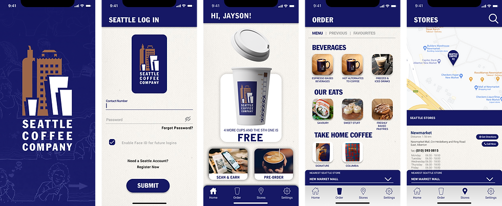
The objective was to develop a mobile application addressing the mentioned challenges. Upon signing in, the app displays the customer's loyalty points on the home screen. When a customer buys coffee, they can simply present their unique QR code for scanning. This not only updates the store's system instantly but also the customer's app profile, eliminating the need for keypad inputs. Additionally, customers can pre-order their coffee and locate the nearest Seattle Coffee store via the app.

Research
As with any UX project, this started with extensive research. I created a coffee survey on Google Forms and discovered some particularly interesting insights. People love their coffee, so this was a relatively easy process. Below are some interesting insights:
• 53.8 % of users drink 2-3 cups a day
• Flavour is the biggest factor when it comes to great coffee
• Bad coffee, waiting in line and wrong orders are the biggest gripes when it comes to coffee shops
• 70% of users haven’t used an app to order coffee before
• 92.3% of users want to be able to pre-order their coffee
• Seattle Coffee was the highest-rated local coffee Company
• Users want a contactless system (for points)
• 70/30% Female to male
• 54% users tested were 25 to 34 years old
Competitor Research
The coffee industry's competitive nature allowed me to swiftly identify and evaluate existing competitors, discerning whether they had associated apps and examining their functionalities. To streamline this process, I created a competitive research matrix and delved into the features of the apps from these competitors. To maintain confidentiality, I've refrained from mentioning company names and have obscured the screenshots.
Brand A Coffee:
• Amazing app with great options. Custom and pre-order
available
• Works very well, has everything you can imagine in a coffee order app
• The Local version of the Brand A Coffee App doesn't have a pre-order
function
Brand B Coffee:
• Sub-par app with a bland interface.
• Custom and pre-order available
• Minimum options, the app feels rushed
• Loyalty System, succinct and works well
Brand C Coffee:
• Beautiful app, great interface. A lot of time was spent on the UI of this app
• Custom and pre-order not available
• Minimum options, but great payment options
• Great Loyalty System & succinct, can send gifts as well
Brand D Coffee:
• Amazing app with great options. Custom and pre-order
available
• Works very well, lacks no options, has most features
• Probably the best local South African Coffee App
Research Summary
Many coffee consumers have unique preferences for their drinks, which is why customized options are essential. Additionally, customers desire the convenience of pre-ordering their coffee and picking it up at a convenient time. However, only two of the local companies researched, Brand B and Brand D, offer this feature. Given Seattle Coffee's reputation for excellent coffee, an inviting atmosphere, and great food, an app would be a valuable addition to the brand. Furthermore, the simplicity of Seattle Coffee's loyalty program is another significant asset.
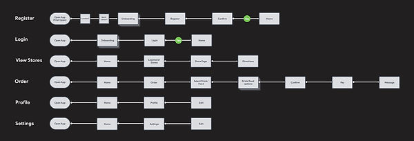
User Flows, Personas, Sitemap, Journey Map
Following the initial research, I moved on to creating User Flows, Personas, Sitemap, and Journey Map.


Sketches and Mini Style Guide
After completing the initial research, I began working on the sketches and mini Seattle Coffee Style Guide. For this process, I went through a significant amount of effort to recreate the logos as accurately as possible. I redrew every logo and went so far as to visit the shops, take images of the menus and recreate them so they align as much with the in-store experience as possible. Butchering logos and fonts has never sat well with me as a designer, so I ensured this was done accurately.

Wireframes to Hi-Fidelity Mockups
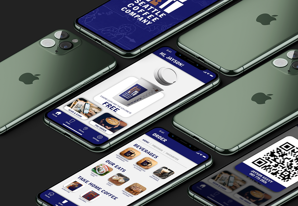
This is currently my favourite part of UX/UI - bringing screens to life. My goal for this project was to create a minimalist design, consistent with the (2020) website design that would result in a classy-looking app. I wanted to attract users to keep using it repeatedly.


Usability testing
User 1: Male | 61 Years old | Engineer | Drinks coffee everyday | Zoom call | 45 min
Summary:
User was happy with how the app worked. Although an extremely intellectual individual, he is not completely tech savvy (Baby Boomer). There was a bit of confusion with how the QR process worked. Once nudged in the right direction, he clicked, and the process went very smoothly. Some of the insights after the session:
Positives:
• Found the app easy to use and navigate
• Enjoyed the cup graphic and the manner in which the UI was laid out
• Enjoyed similarities between the website and the app.
• Enjoyed the fact that he could see which store was closest to him
• Enjoyed the fact that he could save his favourite mix of coffee
Confusion:
• Confused when it came to the QR code and how that worked. He had never used an app in that way before, so after explaining to him how it worked, he saw the value in it
• Wanted a description next to the cart, telling him how many items were in it,
although it does indicate how many there are
• Confused with what information was displayed on the cup on the
main page. “Is this how my cup will look when I collect it?”
• Perhaps have a status bar, instead of the tickable options on the cup
• Wanted confirmation that his order would be correct. He could see this on his transaction history as well as his slip when he collects in store
This was a great exercise in the fact that all the features served their purpose. It enforced the fact that users come in all shapes, sizes, and tech-ability. Having an app that is easy enough for the most basic user is very important.
User 2: Female | 27 Years old | Biokinetisist | Drinks coffee everyday | In person prototype test
Summary:
This user has experience using food apps and other apps that are popular in our culture now. The app was easy enough for her to navigate and she found the processes and user flows efficient.
Positives:
• Found the app easy to use and navigate
• Enjoyed the cup graphic and the UI
• Enjoyed similarities between the website and the app.
• Enjoyed the fact that she could see which store was closest to her
• Enjoyed the fact that he could save her favourite mix of coffee
• Thoroughly enjoyed the fact that she doesn't have to touch any keypads.
• Enjoyed the pre-order feature
Things to Consider:
After the second usability testing session, I found I was second guessing
myself when it came to the user interface. While there are many coffee apps
on the market, I did not want this app to look like that of the competition's. The home screen is the money maker so having a screen that excites the user is really important. So while I feel my original design works well and is functional, it can always be better. I decided to tweak the screens after the usability testing
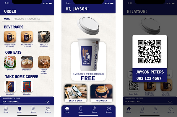
Refinements/Changes made after Usability Testing
The usability testing was incredible and helped me pick up issues early on, which led to changes in the design. These are the final iterations once the last decisions were made
Home Screen
• More modern interface
• Bigger, easier to read buttons
• Omitted the nearest store function
• Omitted the last order and favorites
• Touched up the bottom navigation menu
• Focused on the 3 main solutions:
-
Viewing your points
-
Scanning your code and
-
Pre-ordering your coffee
Scan QR Code
• More modern interface
• Bigger, easier to buttons
• Better UI design/cleaner
Menu
• Cleaner interface
• Bigger, easier to read buttons
• Omitted the nearest store function
• Last order and favorites are placed here on the order page
• Touched up the bottom navigation menu
• Menu is represented by actual menu in stores
Outcomes and Results
Next Steps and Future Functions
• Discussion to be had on the user interface, photos and branding goals
• Actual strategy needs to be discussed, and consensus made with regards to look and feel of app
• How to implement the app - QR scanners will need to be implemented at every shop
• An added news function to update customers on what's happening at WAVE Coffee, perhaps link to Twitter and Facebook
• Decide on what payment methods to use in-app
• Add the various purchasable cups to the app for purchasing
• Add favourites and previously ordered screens
• Add notifications and update customer along payment & order journey

Conclusion
This is an excellent opportunity to provide an app for current customers to track their loyalty points, especially since there isn't anything available currently. Customers have to view their points on their receipt, which can be confusing, and with COVID changing the way we live, customers can now earn points without physically touching any keypads in-store. This was a pain-point for some users during surveys. The app also allows customers to pre-order their coffee, view past transactions, and save favorites. Additionally, customers can view their nearest store and order from it or any other store they wish.
As of 2023, I have not heard back from the coffee company in question. They have added a loyalty portal to their webpage, but they have yet to create an app. Without knowing their business structure and mission, it's hard to pass judgment on whether not having an app has a positive effect on their brand. However, most coffee companies have apps, and it has become expected in today's times.
Looking back on this project nearly three years later, there are many improvements to be made, such as accessibility and colour usage, among others. Since then, I have spent a significant amount of time working on design systems, and I would approach this project from a slightly different angle in the future.


